Thursday, May 13, 2010

Museum Exhibits

One of the benefits, I have found, from working at home fulltime is the ability to do more research and during down times in freelance work, to go out and check out things around the city. These have mainly turned out to be exhibits I never had the chance to go see when I worked in an office all day. When I studied graphic design, my original dream was to become an exhibit designer and I still am amazingly interested in the lighting, information, space and content that exhibits hold. I am most interested in how multiple pieces of information in an open space can be organized, convey content to a wide audience, create a narrative and the strategy involved in creating an emotion or overall theme.

Today, I decided to go to the Minnesota History Museum in Saint Paul. Being a huge history fan, and specifically revolutionary way and civil war history, I went to see the Benjamin Franklin exhibit that is showing through July.

It was a beautiful exhibit with lots of real artifacts and interactive components. But, the real jewel of the day for me was seeing a permanent exhibit in the museum called Minnesota's Greatest Generation. This exhibit focuses on the generation of Minnesotans who were born in the 1910s and 1920s, fought and worked during WWII and started the baby boom generation. I was amazed by the organization and flow of the content, the real artifacts with real stories told by the owners, the interest in the space with interactive and large and small elements and the amount of detail taken into each aspect.


I would highly recommend this exhibit to anyone. The flow is really interesting and even though there is a lot of content to read and take in, you will be drawn to artifacts or objects that are of most interest to you.

A few people have asked me and I decided to write a quick list of some of the favorite exhibits I have ever seen (besides the one I saw today and mentioned above). I do not have photographs of most of them, so check out the sites I have linked.

1. The United States Holocaust Memorial Museumin Washington D.C. designed by Ralph Applebaum Associates I saw this exhibit when I was in the 7th grade and it had a profound effect on me. I went through the space and left feeling incredibly uncomfortable, moved and sobered by the real artifacts (including shoes and human hair). The whole space and the way you are moved through makes you feel a sense of darkness and confinement, without actually physically touching you.

2. U-505 Submarine
at the Museum of Science and Industry in Chicago. I love history, so this exhibit was amazing, but it also had so many interactive content and very well designed typographic information and photographs. You can also get inside of the U-Boat!

3. The Hall of Biodiversity at American Museum of Natural History in New York City. This was recently reopened a few years ago after heavy duty renovation. I did not see it until a trip with my husband in 2007. The sky-high walls of different biological information and then the room with the life-sized whale hanging from the ceiling are both amazing! I was most impressed with the darkness and coolness of the space overall, which gives an underwater sense to the exhibit.

4. The New Bedford Whaling Museum in New Bedford, Massachusetts. I saw this museum in 1999 when I was visiting the Rhode Island School of Design before I began attending as a student. This museum has a whaling ship inside its space and also does an amazing job through the typography and real artifacts of creating general interest in pretty specific groups of information. The museum also is very lucky to be in a typical New England town, right by the ocean, which help adds to the timeless feeling. That included the cobblestone streets and smell of sea water.


Tuesday, May 4, 2010

Negative and Positive Space in Relation to Composition

I began teaching another course at Brainco last week. This quarter, I am teaching the Principles of Design and Layout. Even more than my previous Type 1 class, I find this general subject matter very difficult to fit into a 12 week course.

I ended up dividing my weeks into categories of understanding design when creating my syllabus. This was a great way I found to keep the information organized while still trying to incorporate the elements in design that come into almost every situation. They include but are not limited to: grid systems, form and shape, color theory, inconography and concepting.

For my second class on Thursday, I decided to start out with some general understanding and experimenting with form and shape in relation to negative and positive space. How does this simple idea translate itself into interesting and narrative compositions? Understanding design and layout is about more than the complex elements (typographic content, photography, etc.), which can sometimes overshadow the overall color and flow of the composition.

One trick I was taught while I was a student at the Rhode Island School of Design was to squint at a composition in its beginning layout phase to see its color. The color was not literally its color, but more how the white space and content were interacting with each other. I was also trained to turn a composition on its side or upside down to see the piece from a different perspective? Was it really balanced?

One of the most influential assignments, even if simple, I ever had was to create abstract compositions out of a single letterform. These were created out of only black and white and it took hours of Xeroxing and tracing paper experimentation to create a piece that used the letterform, but without being able to recognize what letterform it was. Does the composition become more or less effective when you add another element?


This assignment really helped me to understand not only that the right composition of positive and negative shape is not always the most obvious or the one you think of first. It always helped me to visualize the different elements in a layout as shapes that would clutter or clear the space.


I decided to assign this to my class on Thursday and worked on recreating the assignment with some example compositions. I chose a Bodoni S letterform and played with white on black and black on white. It is always a great refresher to take design back to its basic form and understand the roots of all the elements we use every day. Below are a continuation of some of the compositions I created.


Maybe as a bonus at some point, I will photograph my original paintings from that past assignment. I still have all the gouache compositions!

Sunday, April 25, 2010

A New Future Ahead

After many months of planning and research, it was finally time to give my notice at the full-time job I had been working at for 2.5 years and to go out on my own. I had made some really close friendships and had gained some very valuable skills as a designer. I had many positives in a full-time job, but I also had learned after several years in the field, what kind of designer and professional I want to be and what kind of projects I want to pursue. It means a lot of changes and a major directions change, but also so many positives and long term goals for my career that I can have control over.

This change was the major reason for the office remodeling. I plan to network and make some new professional connections and a lot of this will be done in various locations. It is great in the meantime, to have a home base and a great office space to work in.

I also plan to take several months to make contact with new clients, but also to develop new web skills that I have not been able to cultivate in my full-time position. I also plan to keep working on my photography and to get back into sketching and going on day long trips for new design inspiration.

Here are some images from one of my sketchbooks that shows some of my research and business planning.


This list shows some of my brainstorming on a business name, before deciding on Flip Design. I should do another post on the development and thinking behind that name as well.


These two photographs shows some examples and notes on logos that I found interesting.


These show layout development for the Web site and also some thoughts on marketing materials.

I have one more week at work and then I will begin my new career adventure. I am excited to get started and see what new skills and creative endeavors I can take on! A big thank you to my husband for all of his support and to my best friend Chandler O'Leary for her inspiration on taking on this new path.

Tuesday, April 13, 2010

ARTCRANK 2010

On Saturday April 10, Jason, Paul, Allison, Josh and I attended the opening of the annual ARTCRANK Poster Show in Minneapolis.

We have been to every one since it started in 2006. The show is a fantastic showcase of local artists visual take on biking and specifically, biking in Minneapolis through posters. This year, the event was held at Shelter Studios on Broadway in Northeast.


These images are views from outside the studio and the bike parking provided by Full Cycle, a non-profit group in Minneapolis.

The venue was a huge improvement in space over the previous years where it had been held at the One On One Bicycle Studio in downtown Minneapolis. I had always loved the previous venue because of its central location and its great style and atmosphere. But, the new location was great since this event seems to get larger every year.


This event has always been such a great mix of the local creative community and the Minneapolis community as a whole. I am always amazed at the posters I end up loving and then purchasing and then the ones I see others leave with that I did not really notice. Many are silkscreened, sometimes in only editions of 30.

We see posters from artists we have seen every year, like Adam Turman and Studio on Fire.


But every year, we also see new artists and each year has surprisingly different styles and an overall feel.


Despite having to stand in line for a while to pay and pick up your posters, it is all worth it, every time. We love this show and will attend every year, even if we run out of room with the number of posters we have acquired. It is a great chance to mingle with creatives and Minneapolis enthusiasts alike. Thanks Minneapolis, for another great reason to live in your city.

Redesigning the Office/Attic Part 2

Just a quick update on the office remodeling process. Last weekend, Jason spent most of the weekend painting and we are so thrilled with the new color. The walls went from a sage green to a clear blue; very light and fresh!

Next weekend will be furniture buying and assembling. I will keep posting as we make progress!


Wednesday, April 7, 2010

I Heart Minnesota Rollergirls

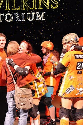
Last Saturday, Jason and a couple of our friends went to the Championship Bout Minnesota Rollergirls Derby at Roy Wilkins Auditorium in Saint Paul. This was my second time attending the awesome, totally aggressive and woman powered series of jams and the last one for the season. We happened this time to be lucky enough to have scored some on the floor seats from a friend of ours who could not attend that night. While I loved seeing it on the balcony last time, on the floor and close to the action was was more fun and entertaining. It also gave me a great chance to take some awesome photographs! The battles between the Dagger Dolls and the Garda Belts in two different halves were amazing with some good, high-scoring jams and some aggressive falls.


I cheer for the Garda Belts because I absolutely love Suzie Smashbox who is a fast jammer and also a good weaver between some good blockers.


I picked up the rules pretty quickly but rather than spend this blog writing them all out, check out the Rollergirls site for more details.

The main bout was between the Atomic Bombshells and the Rockits. I cheer for the Bombshells with my favorite skater, L'exi Cuter.


There was a full house on Saturday and tons of loud cheering, swearing, standing and shouting and whole-hearted enthusiasm when the Atomic Bombshells won the Golden Skate.


OK, so why do I love the Minnesota Rollergirls?
1. It is all women competing.
2. Each skater is their own independent personality with a unique take on their uniform.
3. The crowd is a great mix of people with no pretentious personalities.
4. The semi-punk look and style.
5. The rules are easy to follow and it is fast paced but easy to watch.
6. It is a sport both my husband and I love to watch together.
7. The poster art for the bouts are designed well and are often silkscreened.
8. The competitors are average women who happen to love the sport and have a lot of enthusiasm for the fans.

It is yet another reason I love living in Minnesota and a great addition to my year!