When I started art school at the Rhode Island School of Design in 1999 I pictured being a designer working on business cards, posters and environmental graphics. For 9 years I worked in advertising and traditional print and branding design. About 2 years ago I began to be interested in more interactive and then mobile design. I started designing projects on my own to understand the strategy and complexities of these kind of projects. What I loved was the level of thinking involved in each and every aspect of the user experience.
Two weeks ago I started a new job as a Senior UX Visual Designer at Novu. Novu is a product that runs on a mobile and web platform. It is a health and wellness program that can be customized and outfitted per user. It is sold to employers and insurers and then the team gets is ready for their needs. I am working on the design end of things, so how the product will evolve to in design and user experience.
As I have been doing research on competition and the design standards out there, I am doing a lot of focusing on how to visualize the data that can be generated by using the tool. I have found a lot of infographics out there in a mobile platform that has given me so many great ideas. This is the first job I have had where I feel completely challenged and drive every day to up the design standard and push the experience for the user.
The amazing thing with these kind of graphics is that in an interactive space, as opposed to print, they can move and adjust before your eyes. This adds a dimension to understanding your progress day by day.
Wednesday, May 6, 2015
Wednesday, April 22, 2015
Typography on Walls and Windows
One of the most wonderful things in typography is its ability to transform a flat surface into something decorative and unique. The tradition of painting letterforms or information on windows and doors to retail and food establishment. Large typographic information on the sides of brick buildings is also a tradition that can be seen in cities and towns, large and small. I have noticed a new interest in this kind of typography appearing recently. I think this is because of the increased interest in craft as part of design and the continued love of hand-drawn or tactile text. Even with web and mobile, these techniques can be used to add that visual interest to our space and environment.
Tuesday, April 14, 2015
Simple Branding Applied in a Natural Style
One of the best things about being a designer is seeing how visual design changes based on trends and the interests of the user. I have noticed that modern, simple design has merged into something much more handmade and natural. Some of this is due to people being more interested in organic and eco-friendly materials. I also think it is a pull back from the sanitary nature of modern design in some respects.
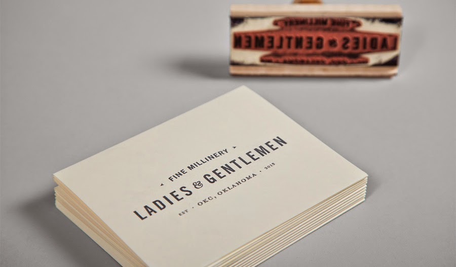
Design does not need to be sans serif on white with no personality or an approachable voice. Design should be something approachable and used in your everyday life. By using simple, nicely designed and well considered typography on branding, packaging and environmental graphics can be brought to everyone. I have pulled some examples I have collected that showcase simple design that still speaks to the items it is conveying. Most use one color, with maybe a highlight. They often use a more traditional style of typography and layout.
I find it refreshing to see how in the age of technology, there is still a relevant place for this kind of design.
Subscribe to:
Posts (Atom)


