Friday, October 26, 2012

Che Guevara

Jason and I have the amazing opportunity at the end of December to travel to Cuba for a photography trip with the Minneapolis Photo Center. We are so excited to be able to spend most of our time just photographing this amazing country that is very difficult to get into from the United States. It has been a long time since we have taken dedicated photographs of anything besides our 2 year old daughter.

As we are planning and getting ourselves ready for this trip, the number one visual I am seeing again and again is that of famous revolutionary, Ernesto "Che" Guevara. We have also traveled to see family in Argentina several times, and his image is often see there as well, since he is Argentinian. But, it is in Cuba that his face, most often this representation are seen and are seen as a national figure. I have read that the photographer of this image, Guerrillero Heroico by Alberto Korda, did not know how popular this image would become when he took it. Even though the photographer was a friend of Fidel Castro and was one of his official photographer, how would be know that image in particular would become so famous? I wonder what it is about this image in particular that so drew in people and captured the spirit of the man?


As I look through photographs of the country, I am really attracted to the various representations of this image that I see in various forms. I wanted to share some of those on this blog just to show how amazingly beautiful and worn some of them are. I am not making any comments about Che as a political figure or his past actions. This is simply a catalogue of some of the ones I have found that I was drawn to. These are not just from Cuba, but all over the world, mostly in Spanish speaking countries.

Monday, June 18, 2012

Illustrations or Photography?

One of the more common questions I get asked as a graphic design teacher is when to use an illustration or a photograph in a layout. This is a very broad question and one that is more complicated than you would think. Each has its benefits and drawbacks and it is up to you as a designer to decide which direction to know. Many things in a project will dictate. You might decide based on the budget, previously established brand standards, the wish of the client or the timing available. PHOTOGRAPHS 
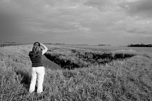
Photographs have the amazing ability to be very diverse and also convey a feeling and emotion in a very short period of time. It can also get to your brand, demographic and location very quickly. They can also be shown in black and white, color and be altered to convey a specific graphic style that corresponds to current trends. Photographs are also very comfortable for most people and they do not require a lot of explanation and appeal to a wide range of people. In the world of digital photographs, they also can be obtained very quickly.
The downside of photographs can be if you are restrained to using stock, you may spend a lot of time and energy looking for one that is not right. Photography can also be very expensive if you go out on a shoot. They can also be limiting in terms of their dimensionality, space and they also have to stay within the constraints of the earth. I also think photographs can be limiting in that you get what you have shot and they cannot be altered as easily once taken.
ILLUSTRATIONS Illustrations are created by very talented artists of all styles and so can be hugely different and diverse from one to another. They also are usually less expensive to create and can be edited more easily, in some cases if they were created digitally. They also can distort space so that dimensionality and proximity are more open. The sense of what relates and scale is totally up to the artist. The colors, interpretation and timeline is completely open and so the possibilities are endless. Illustrations are so wonderfully imaginative and can add so much to a space or piece of design. The downside to illustrations is that unlike photographs, you cannot see the results immediately. The timing can vary based on the artist and because they are so open to interpretation by the artist and the viewer, the meaning and message can become lost. The vision of the director can be harder to verbalize and it can also be hard to find an illustrator that can pull of the style you have in mind. I am also of the opinion that illustrations can be harder to crop and adjust to various formats. The greatest treat as a designer is when you can use both in a wonderful mash up to create something that uses the best of both worlds. In either case, both photography and illustrations have wonderful options. The timing, budget and resources of your project will usually lead you easily to one or the other.

Thursday, May 10, 2012

Long Time, No See (Let's Talk About Badge Logos)

It seems to me that I have been very negligent about my blog writing since last fall. Why is that? It is mostly a combination of freelancing fulltime, being the mother of an 18 month old daughter and trying to sometimes shower and cook food. It also has been a beautiful spring here in Minneapolis so I have been spending a lot of time outside, running to and fro. One definite design trend that I have been following is the badge logo style. I am just as guilty as other designers who use them. I have done several designs lately that use a shape and grouping of text and image to create a bold, dynamic approach. This style is trendy but by no means old. Many logos that are still around today were originally designed with a badge shape. Like the IBM or Pepsi logo and of course a logo we all see around us constantly was originally designed and still maintains the badge style.
What makes a badge logo different from other logos? For the most part, the information is confined within a shape, but this is not always the case. I have attached some examples where the information is still very stacked and grouped and yet I would still qualify it as a badge logo. Mostly, a badge logo is exactly what it sounds like. Imagine a police badge and that is pretty close to how you design a badge logo. Some can be very complicated with a lot of imagery and information. For this type, a badge is a great solution because it can organize and group the information into a small space and still look modern. Some badges are very simple with only 2-3 pieces of information. This also works really well because the addition of the shape around it gives weight and importance to the logo. Below I have attached some of the examples I have collected.
Now that you have seen some examples, they will be hard to miss. I know pretty soon another logo trend will come and dominate. For now, my Type A personality loves the organization and grouping of information that badges do so well.