Tuesday, March 30, 2010

Redesigning the Office/Attic

When Jason and I moved into our house in September of 2005, we fell in love with it right away. We love living in Minneapolis and found a perfect house in the Standish-Ericsson neighborhood. It was built in 1922 and has all the charm and quirks of an old house. We have had to make some changes and buy some new appliances, but that seems to be true of new houses too.

One of the best features of the house is its second floor which is technically a half floor. We have for the past several years had it is a semi-studio. But mainly, it has been used as storage and a location for other household items that we cannot seem to find a place for anywhere else in our 1400 sq/ft house.

I decided a few months ago that I wanted to convert that second floor space into an office with shelving for all of our books, an open workspace and a nicely lit space for our computer. Jason is helping me turn that space into something really creative and conducive to design and research. The hope is soon it will be my full-time workspace and graphic design studio.

Below are some of the images taken as we clean it out and decide what is staying and what is going.


One of the major things we will work on is providing more light since there really is only the two windows on either end. We are also going to paint the space to add some warmth and light.


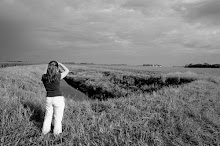
The view of the backyard from the window upstairs.


One round of trash and recyclables that I took out on Sunday afternoon. Notice Jason's Light Saber box which he agreed did not necessarily need to be kept forever. Also, the forms Jason used to design and build my Stewie head which can be seen in an earlier photo.


The photos show the long, narrow closet up in the attic that we have organized to place old school work, portfolio and a lot of art supplies. I would like to eventually have some more organized boxes or drawers to put everything in, but it is working like this right now.

I will post more images as we keep working on this several week plan. Once everything is cleared out, we will know that new elements we need to buy to make this a better office space. Hopefully in May, the office will be ready to go!

Thursday, March 18, 2010

Disruptive Effects Symposium


Whenever possible, I try and attend design lectures, discussion panels and creative shows to see new trends and ideas and also to get in touch with other professionals in the area. Today, my father and I attended a design Symposium called Disruptive Effects: Design Intersections. It was a half day series of lectures given by various professionals in unique creative fields. It was held at the Carlson School of Management at the University of Minnesota campus.


The speakers were wonderful in their approach, concepts and professional experience. The keynote speaker was Jane McGonigal, Ph.D with her lecture EPIC WIN – How Games Can Help Us Solve the World's Biggest Problems. It was an interesting set of ideas and approaches to tapping into the gamer mentality to solve word problems like hunger, global warming and disease prevention. I did not feel I subscribed to the same beliefs and was troubled by the idea of lack of human interaction and physical activity as a means of world collaboration and problem-solving. But, it was a different point of view, for sure and I appreciated her enthusiasm and new ideas for complex problems.


The second speaker was Tom Erickson with his lecture Designing Smarter Cities: Digital Infrastructures for Social Intelligence. His lecture focused around social media and the possibilities for creating "smart" communities, neighborhoods and cities. The idea was centered around how social interaction, through technology and problem solving, can create environments that inspire and change our everyday lives. It was also an interesting concept, one that I thought would have been interesting to add to with city planning, architecture and product design. Since those are fields I am also interested in, I was interested in how those aspects without technology and new social media could impact the way people live.


The last speaker of the day was Nora Paul with her lecture titled Designing for Multiple Media News Delivery: Beyond Column Inches.
I found this lecture the most relevant to me in my profession and also the most entertaining in the speaker's casual delivery. It was also very strong in its research and statistics, which I found fascinating. Through testing, this group of designers and journalists were able to point to trends and usability issues in online media and specifically news consumption online. She also spoke about digital storytelling which I found very interesting since I believe in the strength of the idea and narrative, sometimes over pure aesthetics. What is effective for usability? How do people use online news media? How can this change and evolve to better inform and excite people.

Overall, this was a really productive and informative day of learning and trends not only in design, but in consumer and media trends. I took several pieces of information which will stay with me as I keep designing and developing as a professional.

Wednesday, March 10, 2010

Typography Collages

A few weeks ago, I had my students do an in-class exercise. It involved cutting and tearing pieces of typography in various publications to collage and create abstract compositions. This was to help understand typography as shapes and graphic forms, not just as carriers of information. This exercise was then used as a jumping off point for an assignment where a visual composition or story could be told through abstract typographic forms. The most important requirements were to use only typography and the multi-panel piece had to be in black and white.

I also decided to create some graphic compositions during class, simply based on overlapping, negative space and contrast. I decided if a letterform or series of words became to legible, I would tear them or cover them to create a more abstract layout. Below are my various compositions.


I was happy overall with the collages created in an hour, so I decided to play more with the possible compositions. By rotating, zooming in and changing the contrast, I came up with several different pieces.


There seemed to be endless, really extraordinary possibilities for abstract compositions or possible elements in other layouts. It really was a fun exercise that I hope to use as a technique or a possible concept for posters with other typography or just aesthetic pieces in and of themselves.

Tuesday, March 2, 2010

The Smell of Wood Smoke


This year, my husband and I were lucky enough to be asked by my parents to go with them on a vacation to Breckenridge, Colorado.


My mother is a family physician and as part of her continuing education, she periodically attends conferences around the country. This was often how we went on vacation as children. It was a wonderful opportunity for my parents, my older brother and I to travel all over the country. Often this was in Colorado because since I was three and my brother was six, we have been skiing. It was something that brought us very close as a family and was a sport we loved, especially my brother who skied and raced all through high school.

I sadly had to give it up when I attended college in Providence, Rhode Island and never got back into it. This year, my mother had another conference and I almost jumped out of my skin with excitement when the opportunity came back up for us all to go together. I was especially excited to ski again with my father, who I photographed below.


I was also thrilled to show my husband Jason a location that had been a big part of my life and to get him on skis for the first time in his life.


The skiing is not the only thing I wanted to see again in Colorado. So many of the things that are nostalgic in my life and that I hold dear in my memories are not the things I paid any money for and seem very small and insignificant. My favorite smell to this day is wood smoke, which I remember so vividly from the wood burning chimneys and outdoor firepits in Colorado. I also wanted to go back to the same candy shop we used to go to with my mother and fill up a paper bag with Jelly Belly jellybeans in Vail and then eat for the remainder of the trip.


It is amazing how many of my deepest memories come from our vacation days in Colorado. I also took the opportunity to shoot the many children on their first ski expeditions down the slopes of the Rockies. They have such joy and endurance for the heavy equipment and long walks to the chair lift. They smiled as big at the beginning of the day and at the end, with no complaints and great determination.


I also love to people watch in the different towns and catch them in their interesting ski ensembles and relaxing outside with their pets. They do not seem to change, even after 20 years of visiting.


I can't remember every detail about every trip, but I love feeling familiar emotions when I recognize a particular slope we have skied down before, the passing of a particular restaurant on the street or the sounds of boots walking over the same covered, wooden bridge over the same small creek.

Monday, February 15, 2010

Ohanami

In the spring of 2007, I worked with another designer on a project for a fundraiser at Saint Mary's Basilica. We got the project through some mutual friends and it was a great chance to do some unique design on a very tight budget. While sometimes for a designer, this seems very limiting, sometimes it can bring out your best work. The creative and strong concepts come from strong ideas and are not dependent on the expensive paper or printing.

The theme for this spring event was Ohanami which is the word for the Japanese cherry blossom festival. The only limitations were the budget and the desire of the event planners, for us not to use pink. The challenge would be to create a design that looked sophisticated for the audience, captured a sense of spring and expressed the meaning of Ohanami without sub-text.


Ohanami save the date card

After doing research and investigating some illustrations, I decided on a simple, beautiful and sophisticated approach. I used a light blue to white gradient and overlapping, somewhat silhouetted cherry blossoms that would express an evening event and also the name of the fundraiser. The brown highlights were used to bring in the eye but not distract from the softness of the overall piece. The falling petals were used to draw the eye across the piece from top to bottom and from left to right.


Ohanami Poster

We were asked to design a save the date card, letterhead, invitation, RSVP card, poster and program. A light, serif face was used in conjunction with a condensed, sans-serif that complemented the piece's airy, open style.


Ohanami letterhead

The printing was done at very low cost, so the design and typography needed to hold up to less expensive paper and inks. We also chose to place in the Japanese characters to add a small, but important link to the heritage of the words themselves. They also helped to draw the eye into the center of the piece, where the main content was held.


Ohanami program cover

The pieces were very well received and the project was a really great exercise in several design and production challenges. The design was translated successfully over several pieces, conveyed the mood and theme and also reproduced very well in a very small budget.

Friday, February 12, 2010

Pond Hockey 2010

This post is long overdue, but it took me a while to go through all of my photographs from the day. Like every other year, one of my favorite events during the Minnesota winter is the U.S. Pond Hockey Championships on Lake Nokomis. I don't follow any particular hockey team during the season, but love the game as any good Minnesotan should. I also have the good luck to have the championship right in my neighborhood in South Minneapolis.

This year, the championship was from January 22-24. My husband Jason and our friend Paul and I decided to go on Saturday the 23rd. The idea was to spend a couple of hours on the lake, watching some good old fashioned hockey competitions. Well, this year, the Minnesota weather decided to throw us a curve ball. Instead of the usual, coldest week of the year (well below zero), we got a few degrees above freezing and rain!!!!

Our friend Paul came over to pick us up with an umbrella and plastic bags in his shoes. I still wanted to tough it out and go. So I put on my Minnesota Northstars hat (thanks to our friend Dan Hertzberg) and we made the trek down to the lake.


It was a total mess. For one, usually this event is completely packed with spectators, and this time is was mainly just the players on the ice. They were literally playing in about 2-3 inches of water on top of the ice. Many of them were not playing with a puck, but a small ball that was easier to control… kind of.


I was soaked from head to toe in about 10 minutes and Jason and Paul indulged my love for hockey for about 30 minutes before deciding it was maybe not going to get any drier.


I did see a few kids out there, still having a good time! Children seem to be resilient through these kinds of things.


We only stuck around 30 minutes or so before heading out through the puddles, back home. I am not sure if it even continued into Sunday with the rain still coming down. Hopefully, we have better luck next year. If you ever want to see some heart-warming stories about the joys of pond hockey, check out the movie Pond Hockey: A Documentary Film.

Sunday, February 7, 2010

Foot in the Door 4

Yesterday, my husband Jason and I stood in line yesterday (for an hour or so) at the Minneapolis Institute of Arts to submit our work to the Foot in the Door Exhibition.


It is an open exhibition to any Minnesota resident and is a great opportunity to show some of your work. It is open to any medium (as long as it is not alive or growing). It is limited to one piece per artist and as long as it fits inside of a 12"x12" box, it will be shown at the exhibition.


Jason submitted his framed illustration Burger Cat. It is his take on a very hungry kitty being taunted with his greatest desire, a juicy burger, that is just outside of his grasp.


I submitted a framed black and white photograph I took of a singer in New York City last October. I was really happy with how this shot turned out. It captured a perfect moment during his performance, but also showed the uniqueness of his face.


The show is on view from February 19 through June 13, 2010 in the MAEP galleries. With thousands of submissions, it should be an eclectic, fantastic show!

Monday, February 1, 2010

Grid Systems

Grid systems are such an important part of design, but often one that in the busyness of multiple deadlines, get overlooked or not done at all. I am of the opinion that they are not necessary in every case when the designer is using a more organic approach or is very comfortable with the layout. I think they are viewed sometimes as being too restricting. But, in a lot of cases, a strong underlying grid can expand the design possibilities and add structure and organization. I think this is especially important when text is being used so that the legibility is fully considered.

I was recommended the book Grid Systems by Josef Muller-Brockmann.


Aside from being written in both German and English, the book is very clear and thorough. It takes a fairly traditional and structured approach to the subject matter. But, it breaks down all the information and gives may examples of how they can be used.


You can tell instantly by the imagery and typography that the ideas in the book are taken from the 1960s, but the content really has never gone out of style.


It is a great reference if you are ever stuck with a layout or need ideas on how to organize complex or a multitude of information. I am a solid believer in classic information and approaches to modern design being respected and understood. Once you have these good foundations on basic elements and structure, breaking the rules is easier and more effective.


I would recommend this book on the shelf of any designer. If you know where to look for the information, it can help make sense out of some of your text and visual elements.