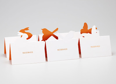
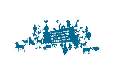
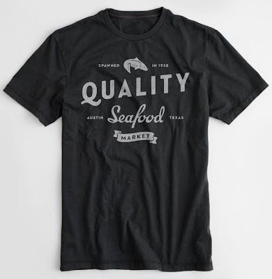
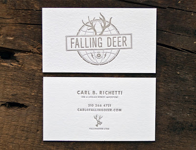
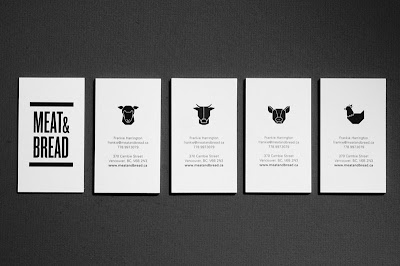
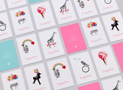
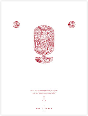
I have found that in general, most animal usage in design is still silhouette based. This is the most immediate way to recognize a shape, and especially for logos, you want that immediate, visual impact.
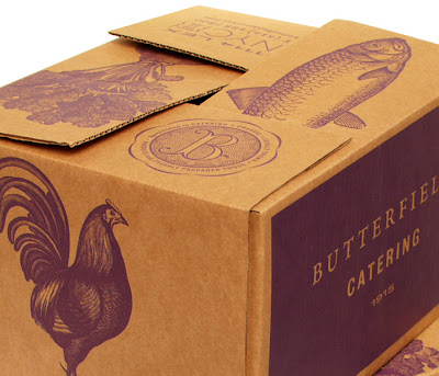
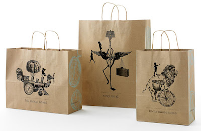
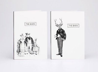
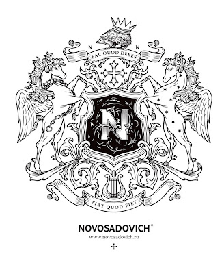
Now, an etching or distressed look is really popular too and I love to see the progression.
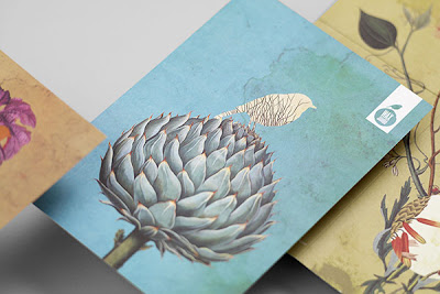
Birds in logos and other graphics still seem to be all the rage as well. Everyone loves animals and they have an immediate association with either very cute, emotional or creepy. They are a great visual to use that have so many creative possibilities.

If you haven't already, check out Charley Harper: http://www.charleyharperprints.com/
ReplyDeleteI have one of his books and it is wonderful! It was a gift and it is now one of the most treasured possessions in my book collection.
ReplyDelete