Wednesday, April 22, 2015

Typography on Walls and Windows

One of the most wonderful things in typography is its ability to transform a flat surface into something decorative and unique. The tradition of painting letterforms or information on windows and doors to retail and food establishment. Large typographic information on the sides of brick buildings is also a tradition that can be seen in cities and towns, large and small. I have noticed a new interest in this kind of typography appearing recently. I think this is because of the increased interest in craft as part of design and the continued love of hand-drawn or tactile text. Even with web and mobile, these techniques can be used to add that visual interest to our space and environment.


Tuesday, April 14, 2015

Simple Branding Applied in a Natural Style

One of the best things about being a designer is seeing how visual design changes based on trends and the interests of the user. I have noticed that modern, simple design has merged into something much more handmade and natural. Some of this is due to people being more interested in organic and eco-friendly materials. I also think it is a pull back from the sanitary nature of modern design in some respects. 

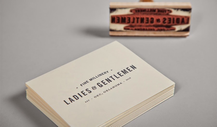
Design does not need to be sans serif on white with no personality or an approachable voice. Design should be something approachable and used in your everyday life. By using simple, nicely designed and well considered typography on branding, packaging and environmental graphics can be brought to everyone. I have pulled some examples I have collected that showcase simple design that still speaks to the items it is conveying. Most use one color, with maybe a highlight. They often use a more traditional style of typography and layout.

I find it refreshing to see how in the age of technology, there is still a relevant place for this kind of design.


Tuesday, April 7, 2015

Design on Amber Bottles

My family and I are devoted to the Seward Coop in South Minneapolis. It is where we get all of our groceries and since the brands are more local and organic, we often come across nicely design pieces. One that I came across last year was Gray Duck Chai.

This packaging attracted me not only because of the typography but also because of the shape of the container. And wouldn't you know it, right after I saw this, I saw many other more indie brands using a similar amber bottle. I think as designer and purveyors of unique products, we like the combination of classic and craft with modern and trendy design. They seem to be different and yet play well together. The amber color also shows off bright colors and white very well. I also think the glass bottle, as opposed to aluminum cans, maintain the quality and taste of the liquid inside. Here are some other examples I found.