Sunday, January 31, 2010

Book Covers

For those who know me well, they know one of my great loves is for books. I read an average of a book a week and this has been true since I was little. Aside from books I want to read for their content, I often choose a book based on its cover. Book design now has changed our understanding of literature so much. Not only is it art, but in many cases, if well designed, the book cover can help convey the meaning or spirit of the story itself. The old saying, "You can't judge a book by its cover." is not always the case, it seems.

In all fairness I must say that some of my favorite books, like A Tale of Two Cities by Charles Dickens and One Hundred Years of Solitude by Gabriel Garcia Marquez do not have the most interesting covers I have ever seen, but are literary masterpieces none the less.

Some books, even if they were mediocre, I will keep because of their cover designs. I have compiled a couple of my favorites here. These are, for the most part, great novels as well. I did not include any of my art books because that is a whole other realm of discussion.


Extremely Loud and Incredibly Close by Jonathan Safran Foer
Everything is Illuminated by Jonathan Safran Foer
The Brief Wondrous Life of Oscar Wao by Junot Diaz
Leaf Storm and Other Stories by Gabriel Garcia Marquez
In the Woods by Tana French
Innocent Erendira and Other Stories by Gabriel Garcia Marquez


The Three Musketeers
by Alexandre Dumas
The Girl Who Played with Fire by Stieg Larsson
The Idiot by Fyodor Dostoevsky
Half Life by Shelley Jackson


On a side note, all the books in this series by Stieg Larsson (The Girl with the Dragon Tattoo, The Girl Who Played with Fire and the upcoming The Girl Who Kicked the Hornet's Nest, are excellent. I would highly recommend reading them.
Thursday, January 21, 2010

Photography

I wanted to share some of my photographs from the past year. I made the switch to digital about a year ago, mostly because finding the materials I used to take and develop my film by hand, became harder and harder. I also had been a member of the Minneapolis Center for Photography (MCP) in Northeast Minneapolis where I used to do all of my developing. It was a great Co-op that unfortunately went the direction of so many old fashioned photography labs. I was heart-broken when it closed, but decided it was time to quit photography all together, or stop being so stubborn and venture into the world of digital. I bought my Nikon D90 and fell in love with it as much as my Nikon F100. I can even use my many lenses, provided I do not need to light monitor. The camera, along with my sketchbooks, seem to go most places I do.


This photo was taken over the summer in my work home-away-from-home, Bob's Java Hut on Lyndale in Minneapolis. It has such a great mix of people and their coconut, chocolate cookies are amazing.


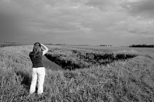
Minnesota farmland, one of my favorite subjects to shoot.


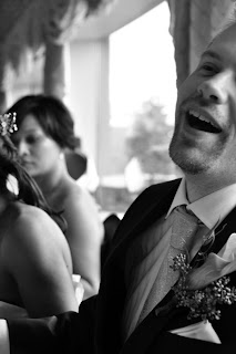
Two of our best friends, Jenn and Dan got married on Long Island in October of 2009. It was one of the best times and abundant amounts of food we ever had.


My father and I drove to Lutsen, in Northern Minnesota in September of 2009 so I could take photographs and he could paint on the shores of Lake Superior.


Walking around New York City with Chandler and Jason in October of 2009.


The Minnesota State Fair in August of 2009. Still one of the best times and a must if you live in Minnesota.


And of course, my niece Laura. She manages to get on my camera every time I see her.

Friday, January 15, 2010

Sketchbooks

Sometimes life gets very busy with working full-time, doing freelance work, taking care of a house, book club and spending time with my family. I do pursue my photography on a regular basis, with whole days spent driving to new locations on a shoot. But, a year or so ago I decided I really missed drawing. When I was young, it was my love for drawing that helped me decide I wanted to attend art school when I graduated from high school. I sketched all through college and then for some reason stopped for several years once I graduated. In late 2008, my husband and I started looking into every coffee shop we could find in the Minneapolis/St. Paul area. At each location, I would do a sketch and Jason would try their mocha. I began to compile a great sketchbook and decided to take it wherever I went, which included some trips to Chicago and our 3 week venture to Thailand in March of 2009.


It was an amazing discovery to see that I loved drawing as much as I remembered. It also is an amazing record, not only of where we have been around the city, but also the conversations and little memories we have of each location when I look back at all of them.

I have since added another sketchbook. Some weeks go by when I have too much going on to get out much and sketch, but eventually, I do miss it and Jason and I go on another round of trying to find a new location to drink tea and coffee and do some drawings.

Wednesday, January 13, 2010

Type 1+2 Teaching Begins!

I started teaching Type 1 and 2 at Brainco last night. I have 13 students with a wide range of experiences in design and other creative fields. Some are writers, some with communication degrees, some have no training in the design field at all. It is going to be a fantastic challenge to create assignments that are both challenging but also relevant as they build their portfolios.

Since this class is combining Type 1 and 2 for the first time, my first class was focused around understanding where each student was in their knowledge of typography. I attended the Rhode Island School of Design in Providence, Rhode Island and was trained in typography over the course of 2 years in the Graphic Design department. Since the class I am teaching is compressed into 13 weeks, the biggest challenge is to create classes and assignments that give enough information but also don't become too technical.


I have assigned two required texts and three recommended ones. Because of the time constraints, I am placing a lot of trust in my students to read and take notes on some of the more technical information involved in understanding typography. The two books I am having them read are The Elements of Typographic Style by Robert Bringhurst and The Complete Manual of Typography by James Felici. There are hundreds of books on typography and these are the two I have found that are the most straight forward and clear in their information. While their focus is on fundamentals and clean typography, I find some of the other books too "fun" in their approach. I want the assignments to be exciting and fun, but I think for good books that you can refer to anytime for terms or information, these two are great!


I intend to read and take notes on all the assigned reading I give to the students as well. For their first assignment, I asked them to do an oral report on 5 historical facts, good rules of thumb or conventions of good typography use. This is just a basic starting off point before I go back to my RISD roots and start handing out assignments that take one week to complete and 4 hours to critique. Well, maybe not that far… But, as my husband Jason Craig, who is also a designer/art director, said to me, "You are going to be a hard teacher."

I really just want my students to find the love for typography that I have and see it as an integral part of the visual communication process.