Monday, August 29, 2011

Branding Beyond the Business Card


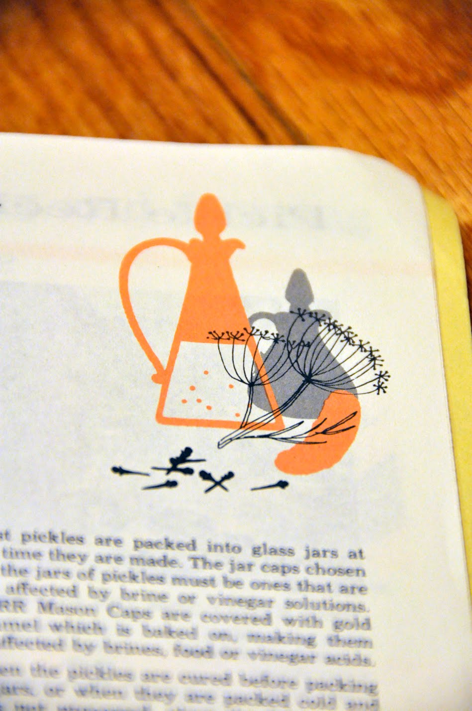
While researching new designs, I love to see examples of branding used on materials besides the business card and letterhead. Especially when it can be used on packaging, on a large scale or in interior spaces, the identity can really come to life. The branding can incorporate more illustration, typography and overlapping of information.

I also studied architecture at one point and so am very interested in logos and branding being used to enhance an exterior or interior space. From corporate office to trendy restaurant, the vibrant use of a company's brand can make the character unique and reach more people. It is the challenge and great joy of the designer to understand the needs and audience of a brand outside of just the logo. Here are some collected examples that I have found of identity developed outside of the usual print materials.


Tuesday, August 23, 2011

New Typography and Illustration Treasures

Last weekend, I went about an hour south of Minneapolis to Oronoco to attend Gold Rush Days. It was a huge flea market in the center of the town with items ranging from antique furniture, toys, clothes, jewelry to tin packaging and lawn ornaments. It was an amazing experience not only to just wander and take some unique photographs, but also to seek out some great keepsakes.

For $1 a piece, I landed two booklets with some beautiful typography examples that I could not pass up. One was a Kerr booklet with recipes for canning from the 1950s and a Palmer Handwriting book from the late 19th century.

They also had some wonderful, vintage photography and illustrations. Here are some samples from the booklets.


So often my students ask where I find my examples or inspiration for design projects. My answer is always to just keep your eyes open all the time. Pull examples from places that are not familiar or where you might not think. Good typography and references for future work is all over the place if you take the time to look carefully and do not pass by things that may seem ordinary at first glance. You may use the style later on for a design that you are stuck on. Magazines and websites have a lot of good references but sometimes the most authentic and textured are ones that have a real world use.

Wednesday, August 17, 2011

Animals in Design

I am currently working on a personal side project with a friend and former student of mine and was in the process of looking for some good animal, illustration inspiration. I looked through past samples I have collected, mainly for teaching, and realized how many amazing examples I have.


I have found that in general, most animal usage in design is still silhouette based. This is the most immediate way to recognize a shape, and especially for logos, you want that immediate, visual impact.


Now, an etching or distressed look is really popular too and I love to see the progression.


Birds in logos and other graphics still seem to be all the rage as well. Everyone loves animals and they have an immediate association with either very cute, emotional or creepy. They are a great visual to use that have so many creative possibilities.